 Sculpture News at SculptSite.com
Oakland Museum of California |
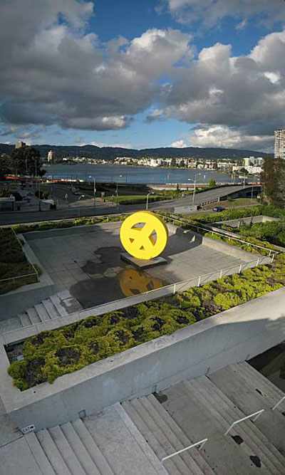
| SFGate by John King The Oakland Museum of California's return to active life offers a way to measure, yet again, the gap between architectural theories and real life. Don't get me wrong: I love the museum designed by Kevin Roche and now retuned by Mark Cavagnero Associates. The terraced concrete forms topped by a sculpture garden offer a realm of architecture that is strong but serene, a space to explore inside and out. But this 7.7-acre complex that fused four blocks into one also is a thing unto itself, withdrawn and not all that inviting until you're inside - exactly the opposite of what Roche set out to achieve. The design was forged in the early 1960s, when architects remained confident that their work could alter cultures and lives, simple as that. Even as the collateral damage of urban renewal became clear - bulldozing neighborhoods perhaps wasn't the key to their salvation - many designers saw themselves as social scientists more than artists. In this case, Oakland taxpayers had approved a bond in 1961 to fund the complex and place it across 12th Street from Lake Merritt. Consequently, Roche wrote before the museum's 1969 premiere, "we felt very strongly a responsibility to make that museum a place where all of the citizens would want to go." And how to entice them? "After investigating the needs of the museums, studying the site problem, and conducting an intensive research into the city plan and its future potential growth, we became convinced that the solution was to create a large open garden plaza in which the buildings would step back, the roof of one museum (gallery) forming the garden terrace of the next," Roche wrote. The logical result, he concluded, would be "a beautiful space that would become the heart of the life of the city." The beauty was achieved, at least if you're open to straight lines and assertive concrete (I am). The heart of the city, the museum is not. As Roche said in this statement, the museum is designed from the inside out and the plaza up. So here's what we see on the street: long walls of thick concrete, including a 75-yard stretch along 10th Street that reaches a height of 10 feet - and you still must pass the loading docks before reaching the museum's secondary entrance. The garden terraces by landscape architect Dan Kiley in their own way are every bit as dogmatic. It's what he promised early on: a procession of gardens that "in scale and magnitude will resemble those of ancient Mesopotamia." Again, great once you're inside. From the outside it could be an overly abundant nature preserve, massive green mounds best admired from afar. This well-meaning masterpiece never became an urban magnet. Walk the two blocks up 10th Street from BART and there's no signal of the treasures within, no art-tinged street life. You walk, you're confronted by concrete and green, you find your way inside. The scene on the east is another story. Lake Merritt today is Oakland's common ground, easy and beguiling and a free-strolling delight. It is a connector as well as a destination, an undeniable case that there's more to the city than crime rates and proximity to San Francisco. Separating the lake and the museum today are 12 lanes of ramped roadways that form a barrier as daunting as Mesopotamia's walls. The good news is, that will change: On Thursday, the city begins a two-year, $35 million project to complete the trail around the lake in this area. The effort will include thinning the asphalt next to the museum from 12 lanes to six, adding crosswalks as well as new landscaping along the water. This is part of another Oakland bond, Measure DD from 2002. My guess is that the common changes aren't the outgrowth of "intensive research" so much as common sense. Buildings are important but often, the space between them is more important. To the extent we make our larger urban environment enticing, the more likely that people will want to find their way there. Simple as that. |
 |
More Sculpture News ....
Submit your SCULPTURE NEWS.
It's easy, just send us an e-mail
(click on Submit News in the left menu) with your pertinent information along with images, we'll take care of the rest. Sculpture makes our world a much better place in so many ways!
SculptSite.com, along with Sculptors and their creative genius all helping to bring the beauty and message of Sculpture to a hurried world.

